Looking for your honest opinion...

xtremarine

Registered
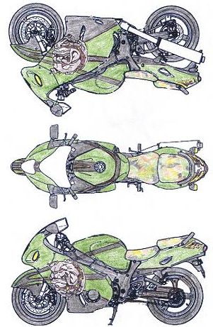
So ICON came out with this great moto helmet and I decided to come up with a paint scheme to match. So tell me what you think honestly.

Thanks for your honesty.....Jay

1 from this.JPG


2 blank canvas.jpg


03 the scketch.JPG
 
Last edited:
looks real good...I have to get some pics to you of my buddies bike...he has a similar color and had rivets and some depth shading added to it, you might like how that looks...bet it'll look sweet once you get it all done!:thumbsup:
 
It's a great theme, bro. Personally in concept it's awesome and I know there are a LOT of people here who would appreciate it.

Done properly, it'd be a tough, awesome machine.

Very creative.
 
cool idea I think something else should be done with dogs body, right behind the collar. Maybe just stop after the collar or add a body maybe there is one i just can't tell by the pics it seems to just be an undefined blob for a body. But once again cool idea I would just do some tweaking.
 
I dont know bro. Just being honest. Maybe if you added to the dog some more body so it doesnt look so "cut and paste" In other words the face just looks like a sticker right now.

edit: joncook types faster than me :laugh: I think he and I are seeing the samething
 
Last edited:
that helmet is comfortable , i have the same in flat black . No compliants . The paint ? Is that kawa. Green ? I am color blind ya know . It's all about you on the paint . If it's done right it will look good .
 
Thank you everyone.

1. I see what you mean about the BULLDOGS body. We've got some great air brush artist over here so I will give them creative license on this project.

2. Also the helmet has what looks like shrapnel damage to it I think this effect would add to the design but leaving that up to the artist.

3. The first colored picture was done with colored pencils. The final was touched up in ms paint studio for the digital effect.

Again thank you to everyone for the honesty. Once funds are available right after the holidays I will be getting this scheme. I will post pix.
 
I think its crazy to match a color scheme for a bike to a helmet. If youre anything like me, you will have a new helmet next year, then your paint job doesnt match it.......just my thoughts.
 
I think that it looks pretty good. Just make sure that your time and $ are worth it. It's original, so me like! Ya know, it's damn hard to make a Busa look bad; it's just makin' it look unique and what you like that counts!:soapbox::laugh:
 
Last edited:
Are you picking flat, matte, or gloss for the clearcoat?

I think the design looks great!
 
Current bike and helmet. I get bored so I create a new scheme every so often. Got to love cheap plastics on ebay.

l_255ce856fd79c7033aeacbaab86c3eeb.jpg


l_2c38e39e03ef00d958df8b9db527e971.jpg


l_3e95f3b4fff216b8ee3db0dbf5d7edd0.jpg


helmets-icon-racing-street-2007-men-mainframe-manic.jpg
 
A closer look so you can see Dragon on left of Punisher Skull. Main problem with this design night riding is hard.

m_2a673164d566d3b8de919c808e8be68a.jpg


l_d7cc40aa53642756ac726c503636b584.jpg
 
Last edited:
Back
Top